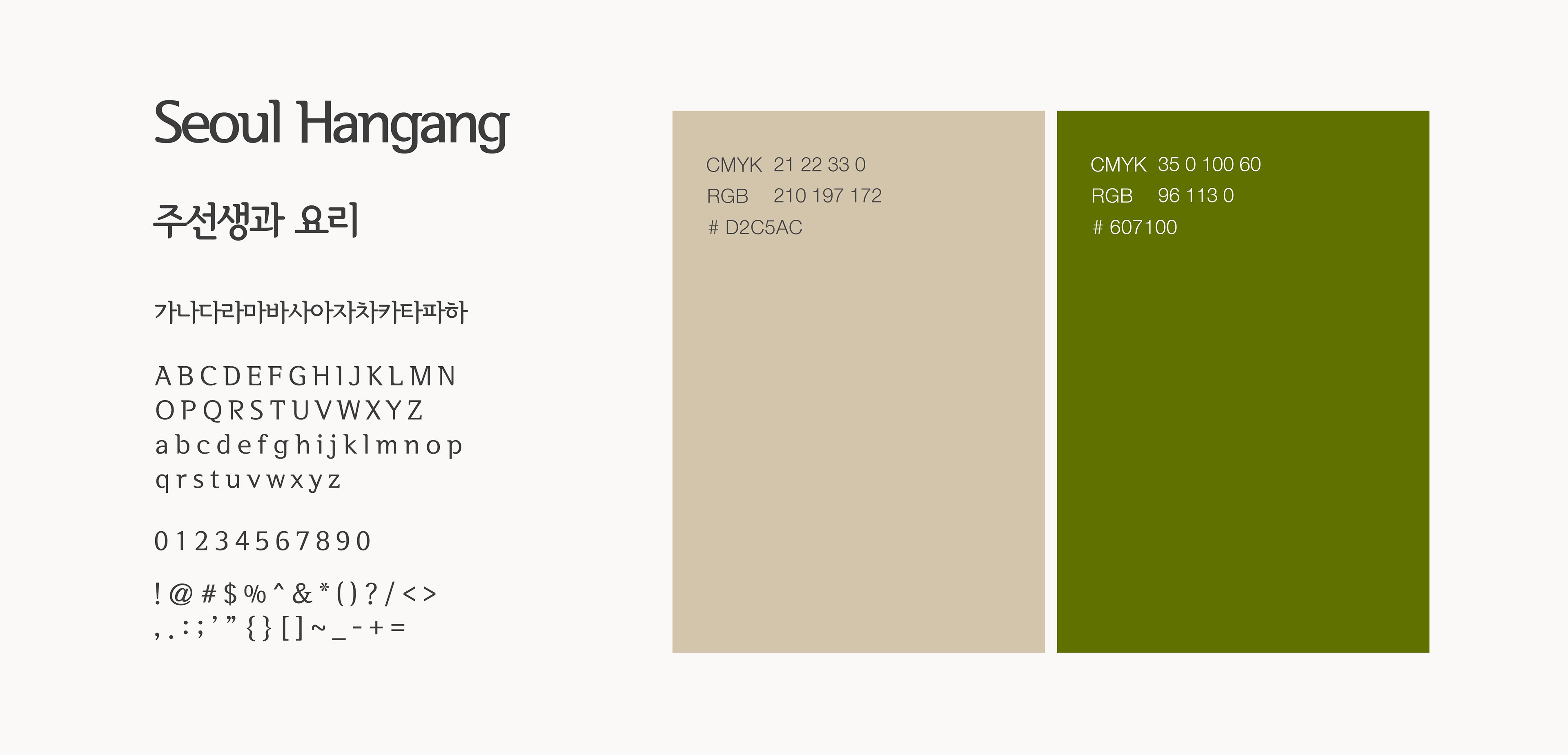
JU SUNSENG
Brand Renewal Project
-
2020
Designed by Minwoo Kim
Client: Jusunseng - Food service start-up in South Korea
Project type: Part-time
The owner of Jusunseng Chef Ju has operated and studied about Korean cuisine for more than 20 years and recently expanded its business in the foodservice industry. Redesigning for the logo and packaging was necessary for the new business concept.
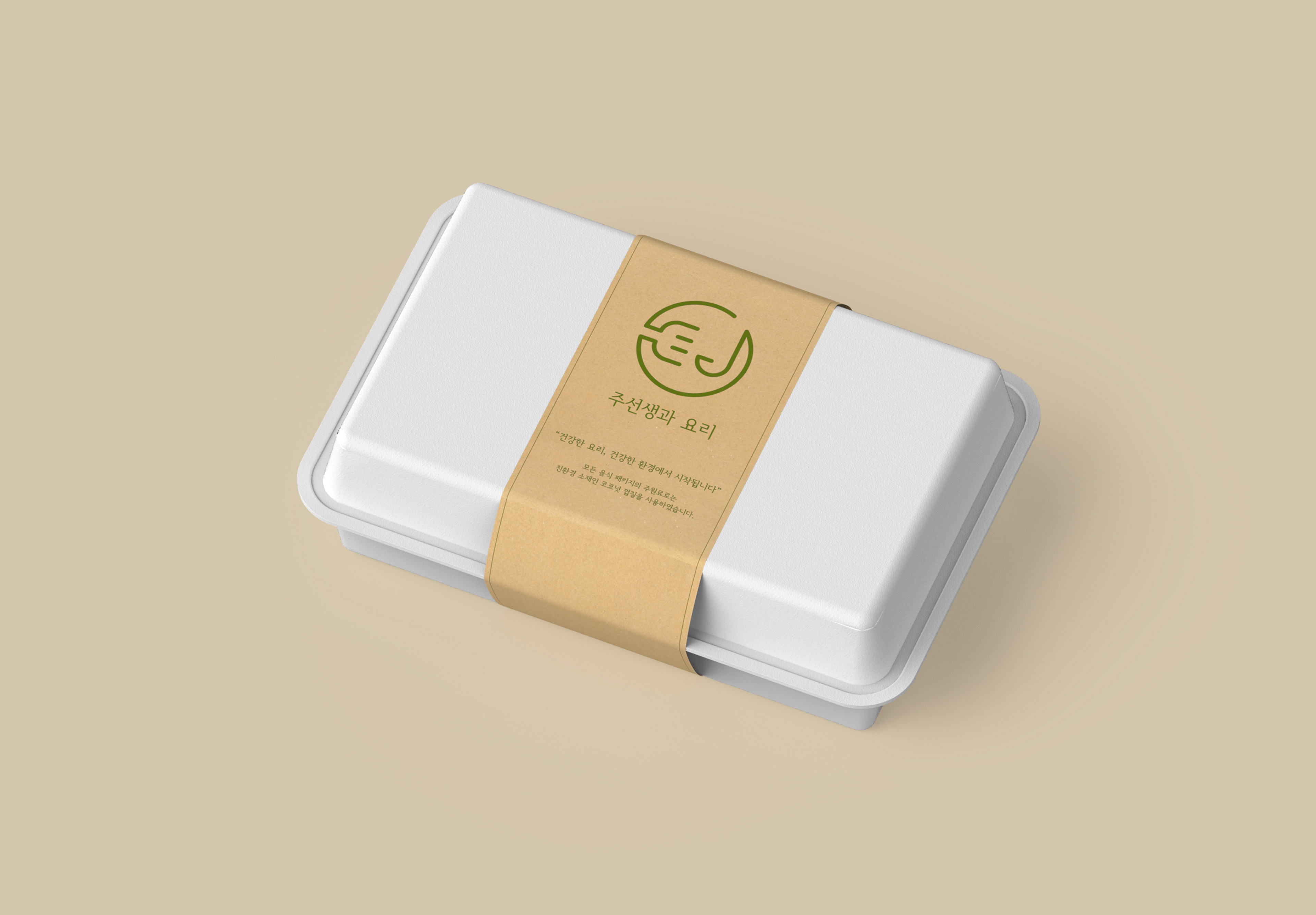
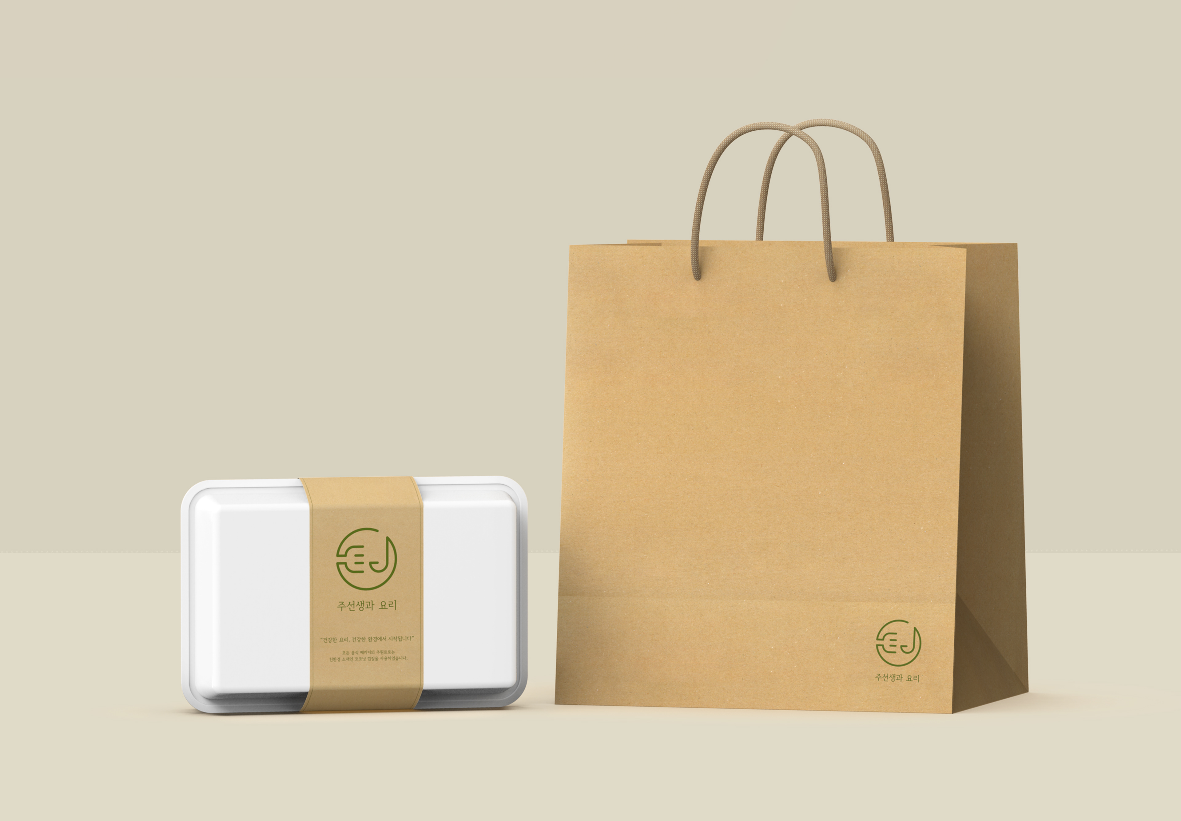
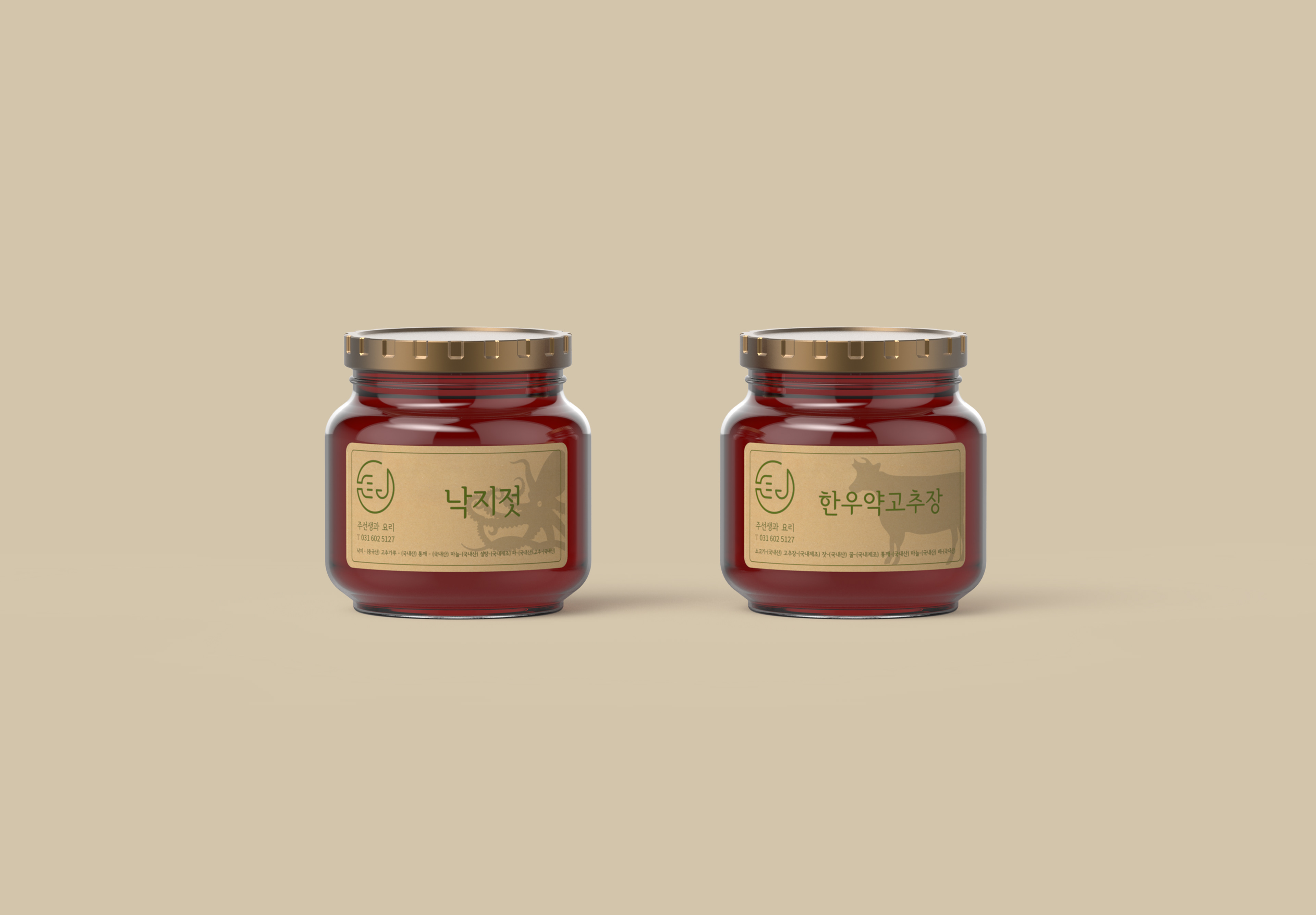
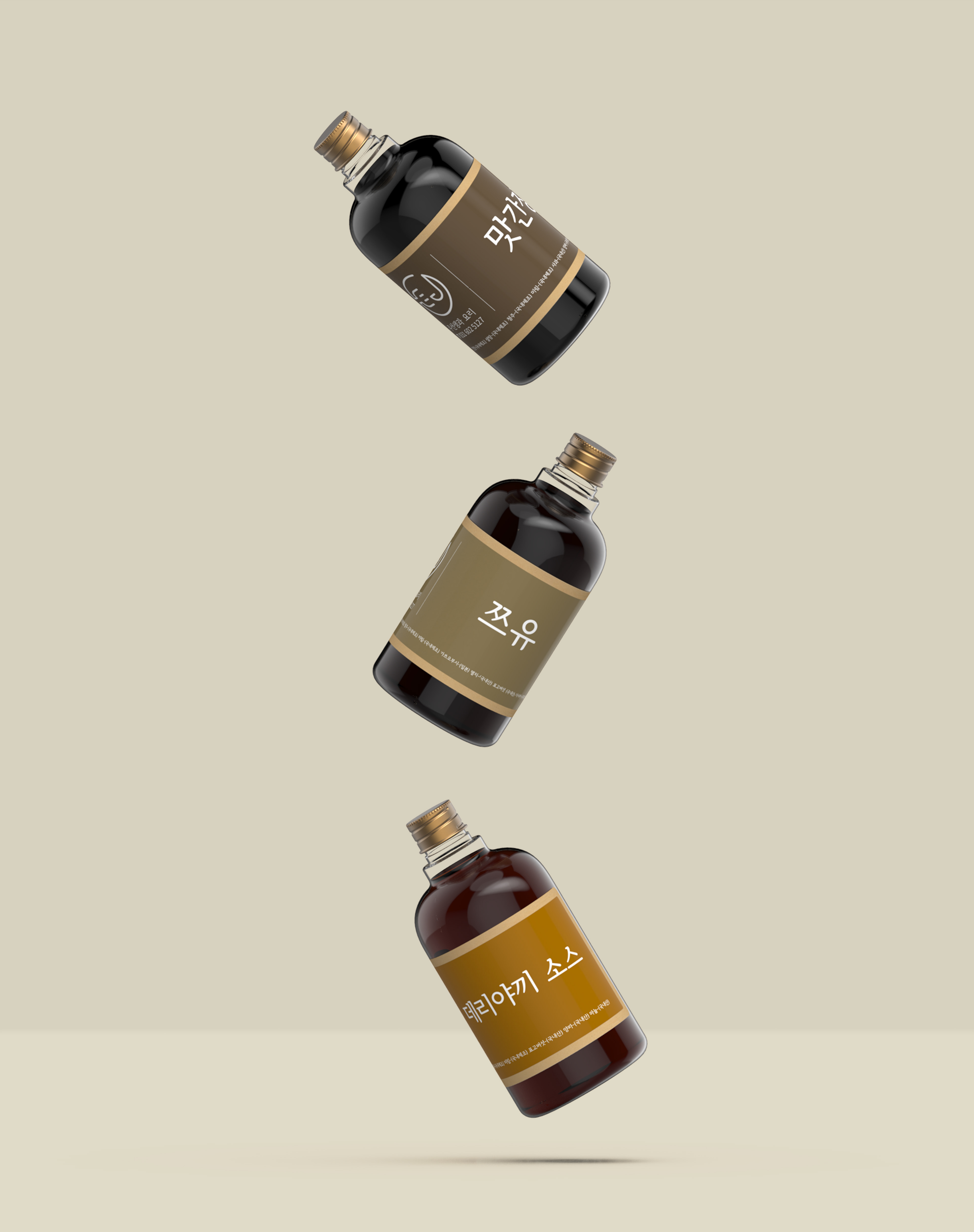
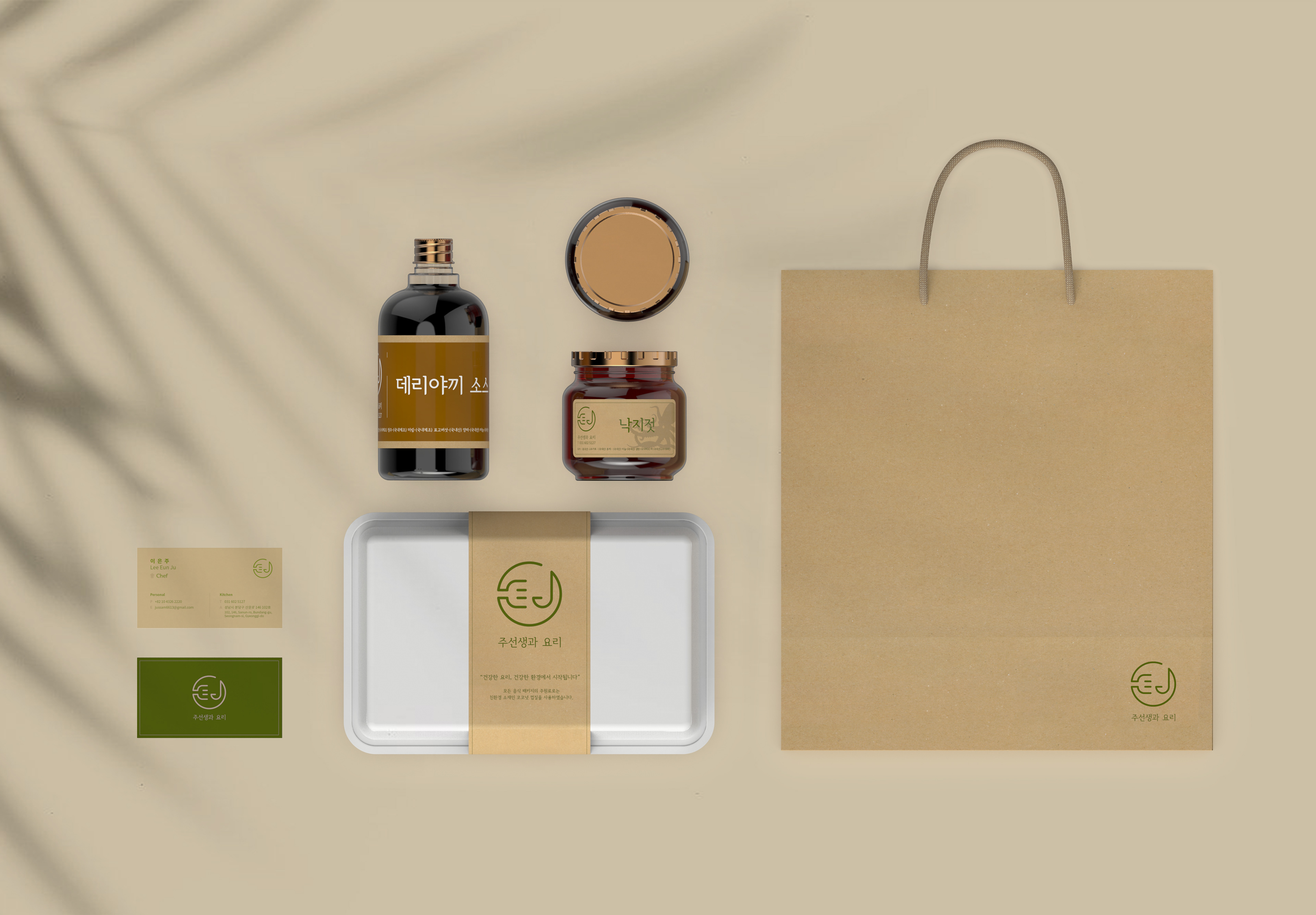
The new business concept is to allow customers to cook healthy Korea cuisines in the most simple way through Jusunsengs unique cooking box. The cooking box lets the consumers to feel the warmth as if they are having a delicious meal at home with their families wherever they are. Jusunseng not only provides new recipes month by month, but also maintains the quality of the product high. Consumers can also create their own special meal through Jusunseng’s unique sauce and side dish products.
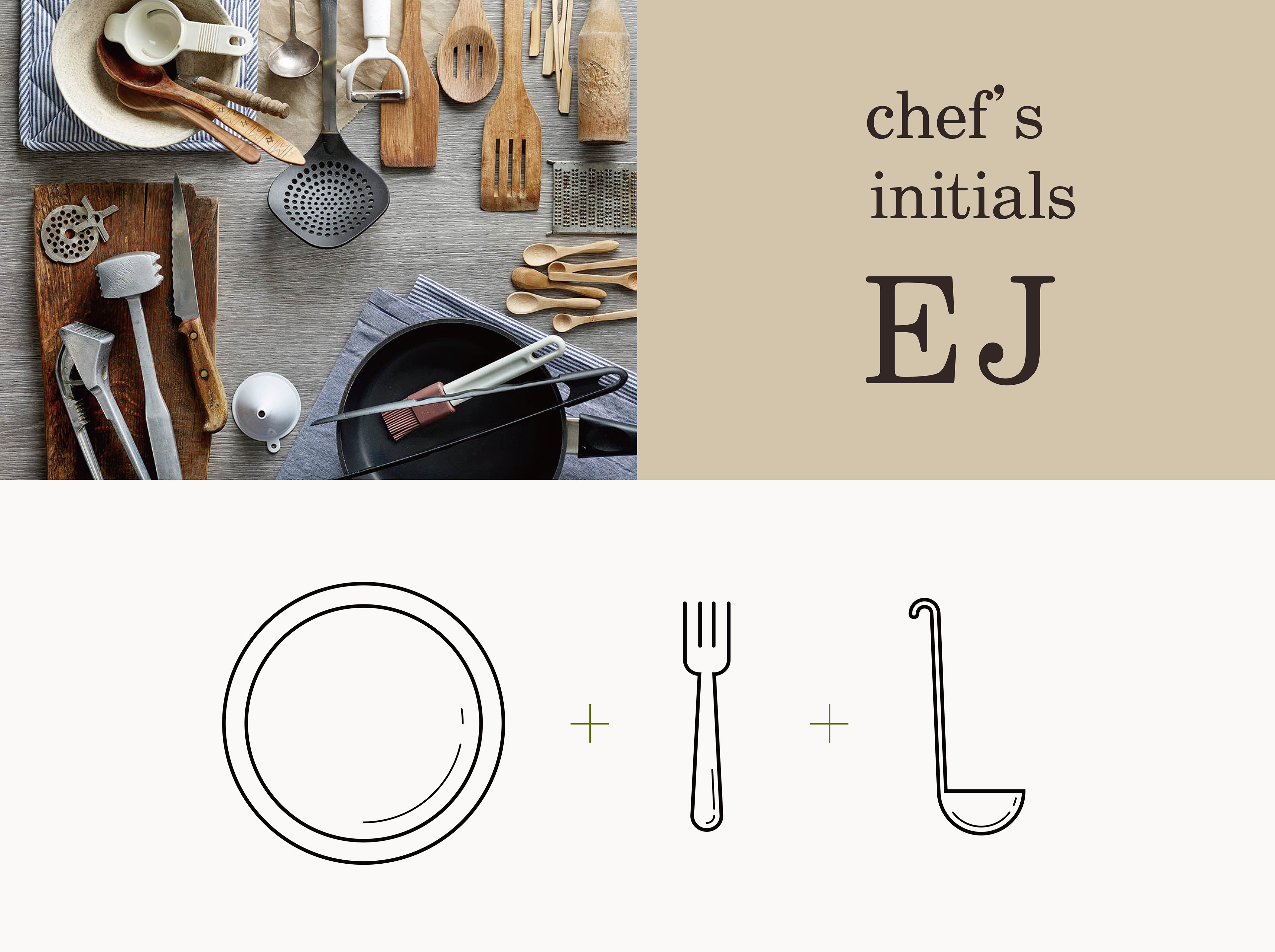
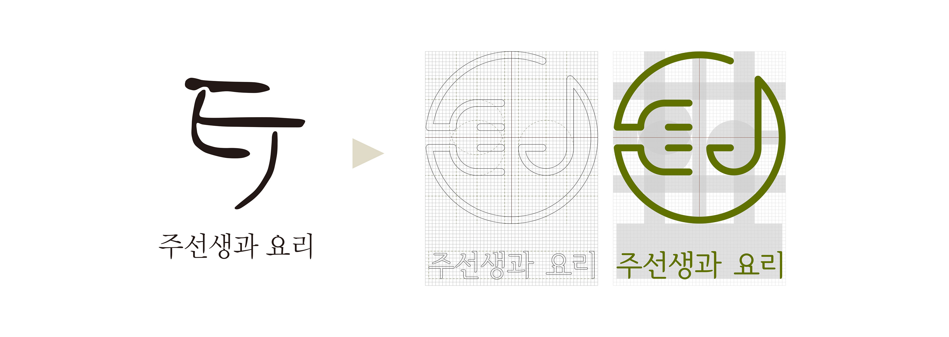
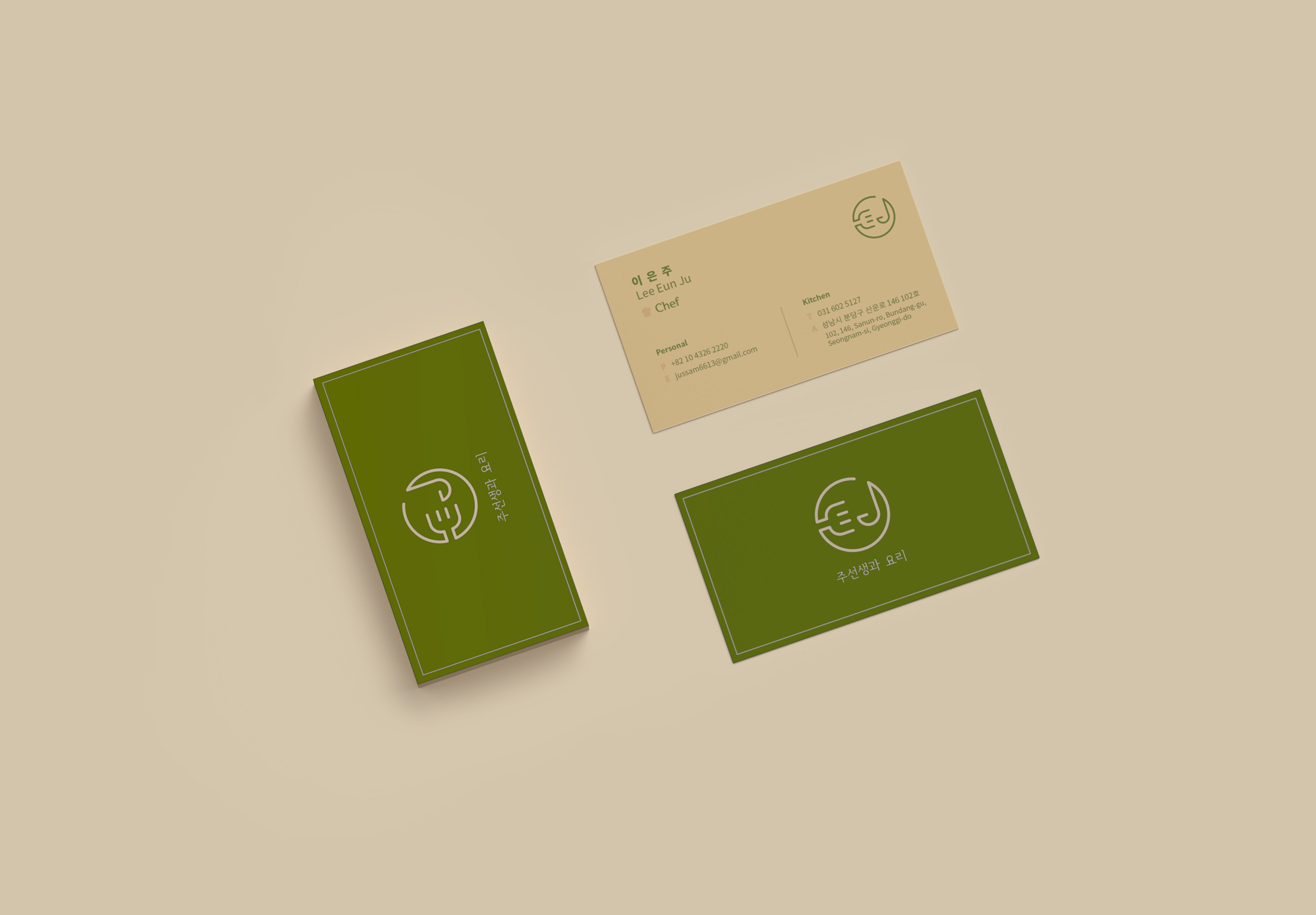
The shape of kitchenware and combine with Chef Eunju's initial "E and J" to design a new logo. Each element of logo contain special meaning, a circle that surrounds the logo means plate, the E is a fork, and the J is a ladle. The food that Chef Eunju prepared with love and affection and scene customers cook easily and enjoy it, are expressed in the new logo.